

Yellow, orange, or red?
When it comes to high-visibility workwear, the color you choose isn’t just about branding—it’s about being seen.
But each color behaves differently depending on light, background, weather, and job site environment.
So how do you know which color is right for your team?
Let’s break down the science, standards, and strategy behind choosing the right hi-vis color for the job.
Why Hi-Vis Color Choice Matters
Hi-vis colors are designed to contrast strongly with most surroundings—urban, rural, industrial, or natural.
But:
- A fluorescent yellow vest may blend into dry grass
- Bright orange might get lost in brick or red clay zones
- Red hi-vis may be non-compliant in some regions
⚠️ Choose wrong, and you lose the whole point of high-visibility clothing.
✅ Color choice affects:
- Reaction time of vehicle operators
- Recognition speed by teammates or machinery
- Compliance with industry or government standards
The Three Main Hi-Vis Colors
🟡 Fluorescent Yellow-Green
- Most visible color in daylight
- Performs well in urban or dim environments
- Common in logistics, warehousing, delivery sectors
- Often chosen for indoor or mixed-light workplaces
Best For:
✔ Warehouses
✔ Utility work
✔ Roadside cleanup crews
✔ General construction
🟠 Fluorescent Orange-Red
- Strong contrast against natural environments (grass, trees)
- Easier to see than yellow in fog, dusk, or concrete areas
- Common in roadwork, traffic control, aviation ground crews
Best For:
✔ High-speed road zones
✔ Airport tarmacs
✔ Emergency responders
✔ Heavy equipment zones
🧠 Research shows orange is easier to spot than yellow from a moving vehicle—especially in low-angle light (sunrise/sunset).
🔴 Fluorescent Red
- Less common, but used in rail industries or where color coding for danger or authority is required
- Offers a psychological cue for urgency or command
Best For:
✔ Rail transport workers
✔ Firefighters or response teams
✔ Specific national standards (e.g., UK’s Network Rail)
⚠️ Not all standards accept red as a compliant color. In EN ISO 20471, red is allowed only under specific conditions and must meet brightness thresholds.
What Do the Standards Say?
ANSI/ISEA 107 (USA)
- Accepts yellow-green and orange-red
- Red not listed as a primary compliant color
EN ISO 20471 (EU)
- Accepts yellow, orange-red, and red
- Each must pass specific fluorescence and luminance levels
| Standard | Accepted Colors |
|---|---|
| ANSI 107 | Yellow-Green, Orange-Red |
| EN ISO 20471 | Yellow, Orange-Red, Red |
✅ For export, always confirm which standard applies in the destination market.
Matching Color to Background Contrast
| Job Site Background | Recommended Color |
|---|---|
| Green fields, forests | Orange or red |
| Urban roads, grey concrete | Yellow or orange |
| Dry grass, yellow sand | Orange |
| Brick, clay-heavy sites | Yellow |
| Snowy areas | Red or orange |
✅ The goal is maximum contrast, not just brightness.
When Color Impacts Job Role or Hierarchy
Some companies use color to distinguish departments or roles, such as:
| Color | Meaning / Role |
|---|---|
| Yellow | General workers or labor staff |
| Orange | Site supervisors, forklift zones |
| Red | Emergency team, visitor alert |
| Green | First-aid or safety marshals |
🚧 This helps during emergencies or evacuations—colors become fast identifiers.
Other Factors to Consider
- Branding alignment: Want your team to match your logo or fleet? Choose wisely.
- Visibility in video surveillance: Some colors reflect better on CCTV footage
- Worker preference: Don’t ignore feedback—uncomfortable color = low compliance
- Cultural context: Red may signal “danger” in one region, “authority” in another
What to Ask Before Ordering Hi-Vis Gear
- Which standard applies to my project/region (ANSI or EN)?
- What’s the surrounding environment where gear will be used?
- Are we working day shift, night shift, or both?
- Do we want to use color for role coding?
- Is red allowed for my use case under EN ISO 20471?
At workwearsolutions, we help clients choose colors that meet safety goals, compliance needs, and company image—all at once.
Conclusion
Hi-vis clothing only works when it’s seen—and color is the first thing people see.
As a buyer:
- Choose based on contrast, not just preference
- Confirm your color is certified by ANSI or EN ISO
- Match color to environment, work zone, and job type
- Consider using color to enhance team organization or safety signaling
Need help selecting the right high-visibility colors for your team? I can help you analyze your work environment, regulatory needs, and branding to create a hi-vis solution that keeps workers safe—and easy to spot.
📩 Contact: [email protected]
🌐 Visit: www.workwearsolutions.net

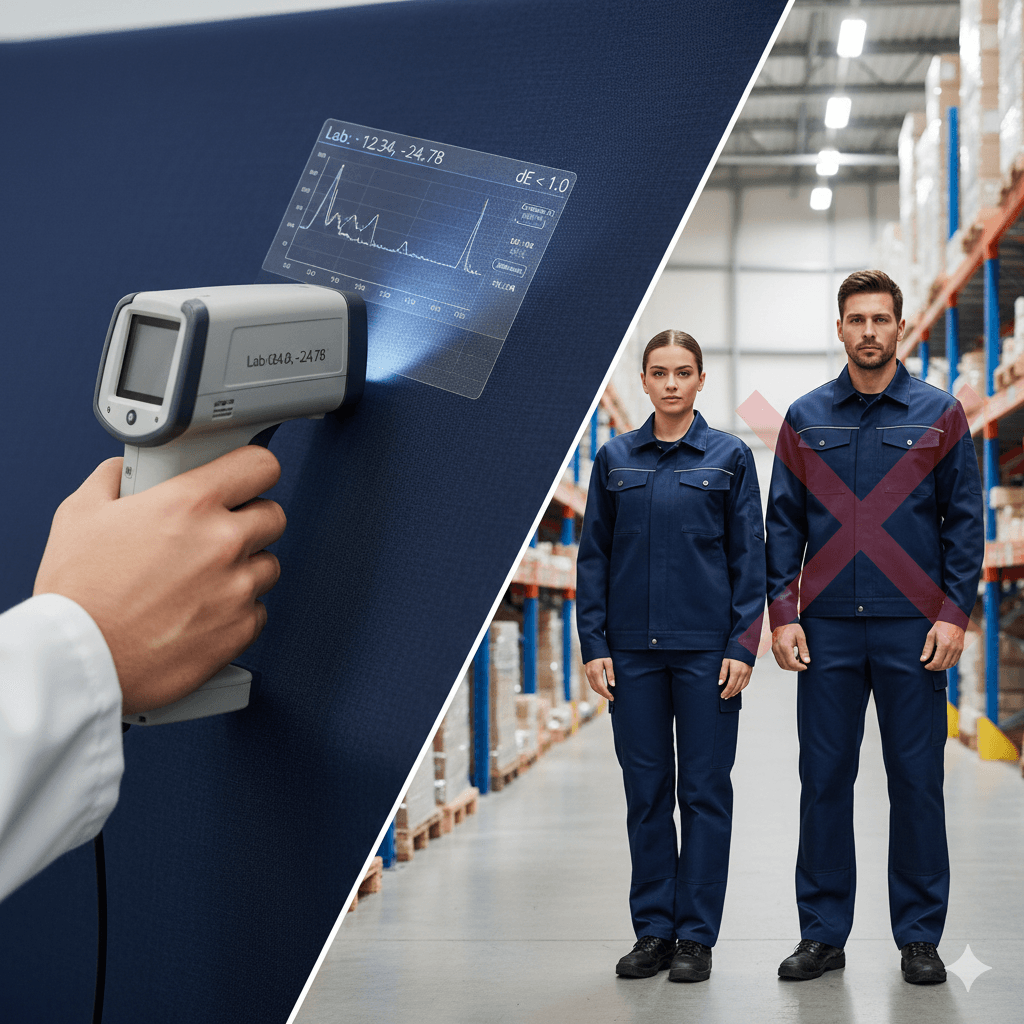 Color Consistency: The Delta-E Standard and the End of the “Clown Suit” Effect2026年2月4日In the corporate world, a uniform is a brand’s […]
 Why Zippers Fail (and How We Prevent It): The Engineering of Closure Reliability2026年2月4日In the hierarchy of industrial garment components, the […]
 The Anatomy of a Seam: Engineering Durability at the Needle Point2026年2月4日In the world of industrial workwear, the fabric gets all […]
 Future Lab PPE Trends: The Convergence of Lightweight Protection & Sustainability2026年1月28日In the sterile corridors of pharmaceutical R&D, biotech […]
 Chemical Protection Classes A/B/C: The Definitive Guide to Risk-Based PPE Selection2026年1月28日In the hazardous materials (HazMat) industry, […]
 Freezer Gloves & Boots Trends: The Intersection of Thermal Physics and Grip Technology2026年1月28日In the unforgiving environment of a -30°C cold storage […]